Screen 1 — Solar Overview + X-ray Flares + Coronagraphs + Magnetogram
Summary
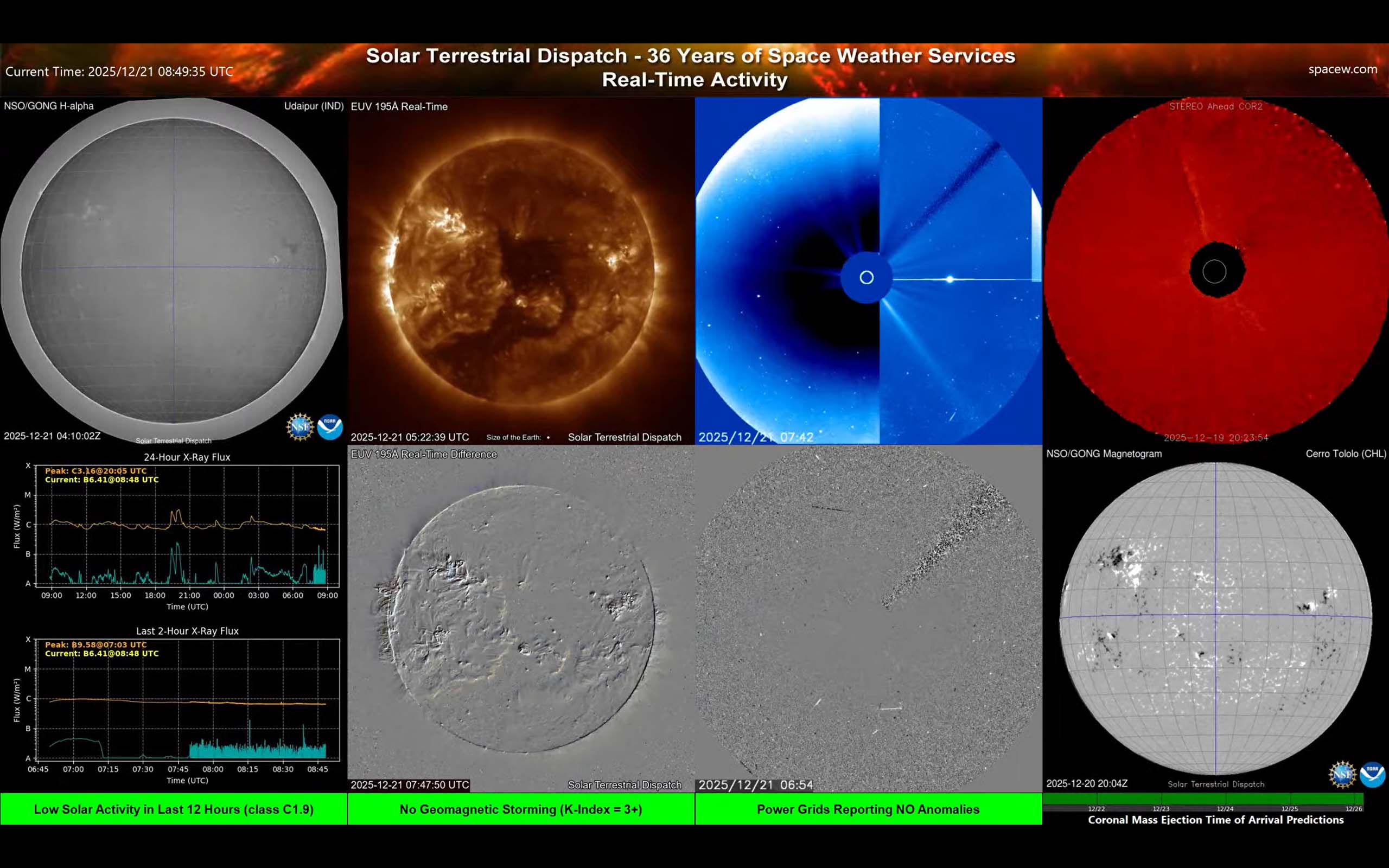
This is a broad “what’s happening on the Sun?” dashboard. It combines a chromosphere view (H-alpha, top-left), a hot-corona view (EUV 195Å, top-left-middle) and coronagraph views for material leaving the Sun (Coronal Mass Ejections).
More detail
Top row: what you see on and above the Sun
- H-alpha (left): Shows the Sun’s lower atmosphere (chromosphere). Dark “filaments” (cool, dense plasma held up by magnetic fields) can sometimes lift off and erupt.
- EUV 195Å: This shows the hotter part of the Sun's atmosphere (the corona) from the GOES-19 spacecraft. Bright areas often sit above active sunspot regions; darker patches can be coronal holes (often linked to faster solar wind streams - see Screen G).
- Coronagraphs (blue/red, upper-right): These instruments block the bright Sun with occulting disks so that faint material can be seen streaming outward from the Sun (Coronal Mass Ejections). This is where you look for a CME as an expanding cloud moving away from the Sun. The red (upper-right-most) image from STEREO A is from a spacecraft that is not in Earth's orbit, but is going around the Sun at a different rate than the Earth (ahead of the Earth in its orbit - hence 'A'). It is used by space weather forecasters to help nail down the trajectory of coronal mass ejections and whether they might be earthward-directed. To do this, it is best to have observations from multiple vantage points. The upper-middle-right image (blue) is from SOHO, orbiting the Sun with the Earth. Differenced images from the coronagraphs (bottom-middle-right) subtract one frame from another to further enhance detail of moving features (like expanding CMEs).
Bottom left: GOES X-ray flux (flare intensity over time)
- 24-hour X-ray flux: Shows flare history and overall activity level. Bigger spikes mean stronger flares. Flares are rated as class A, B, C, M and X (in order of increasing x-ray intensity). Longer duration x-ray flares are usually of greater significance and are more often associated (but not always) with coronal mass ejections.
- Last ~2 hours X-ray flux: A “zoomed in” version so you can see recent changes clearly. This version uses much higher time resolution x-ray data from the GOES spacecraft.
In plain terms: this is the “flare meter.” If you see a sudden spike, the Sun just released a burst of X-rays (a flare). Each flare category (A/B/C/M/X) letter is 10 times stronger than the previous, similar to how a magnitude 7 earthquake is ten times stronger than a magnitude 6 on the Richter scale.
Bottom left middle: change-detection (“difference”) views
- Difference images are “new minus old” style products. They are very good at revealing what changed recently (a sudden brightening, a dimming region, an expanding coronal wave, etc.).
- Why it matters: When you’re scanning quickly, difference views help you notice subtle events that are easy to miss in normal imagery.
Bottom right: magnetogram (magnetic map)
- What it shows: Where magnetic regions of opposite polarity are located on the visible solar disk.
- Why it matters: Strong, complex sunspot groups are associated with magnetic fields where the most energetic flares and eruptions tend to originate. This shows the size and magnitude of those magnetic fields.
Practical tip: Use this screen to help answer: “Did a flare happen?” and “Do we see a CME leaving the Sun?” For “will aurora happen at Earth,” you’ll also want near-Earth solar wind and Bz (see Screen 3) plus ground magnetometers (Screen B). Current near real-time auroral activity is available in Screens E and F.