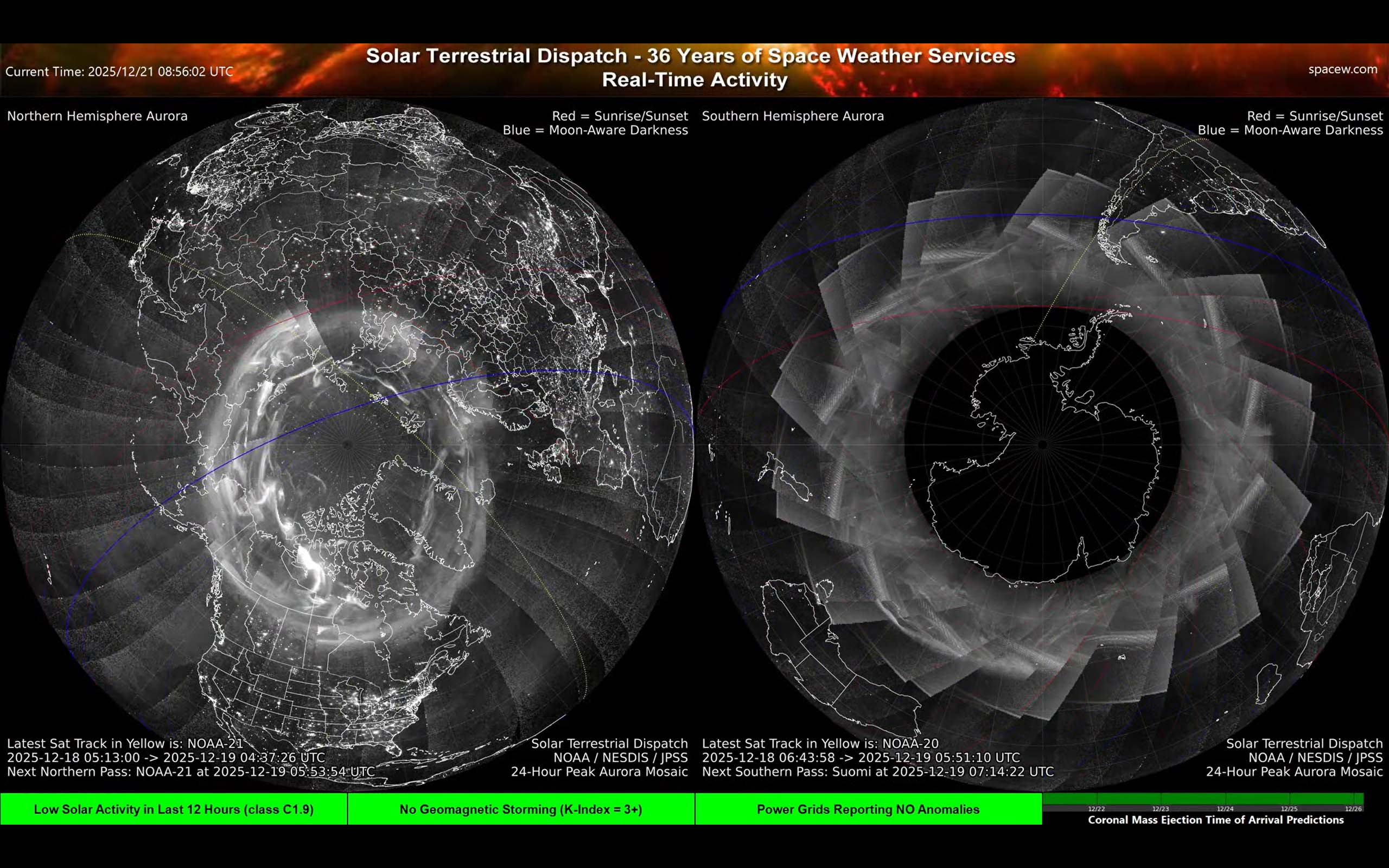
Screen E — 24-Hour Peak Aurora Mosaic (Northern + Southern Hemisphere)
Summary
This is a stitched ‘best of the last day’ view of auroral brightness from satellite passes. It’s excellent for seeing where aurora has been strongest recently, but it is not a single moment in time.
More detail
How to read it
- Bright areas indicate stronger auroral emission observed during the last ~24 hours.
- The mosaic looks patchy because it is built from multiple satellite passes at different times.
- Lines for sunlight/darkness help interpret where aurora could be visible from the ground (you need darkness and clear skies).
- Refer to Screen D for information on the blue, red and yellow lines.
What it’s good for
- Understanding the overall “shape” and preferred regions of aurora during the past day.
- Spotting whether the auroral zone has been consistently active or mostly quiet.
If you like DETAIL: Solar Terrestrial Dispatch produces extremely detailed (less than 1 km per pixel) summaries of these 24-hour peak activity mosaic's, available here. They're fun to look at because they also show the city lights that were active on that day. Cloudy areas will blur city lights. Be aware, however, that these images are HUGE (more than 16,000 pixels square) and will require close to 100 megabytes to download. >
In the detailed high-resolution images (above), you can often find ocean lights from fishing fleets. For example, the movements of squid jigger fleets off the eastern coast of South America can often be found.